A visualization constructed using the vega-lite-api.
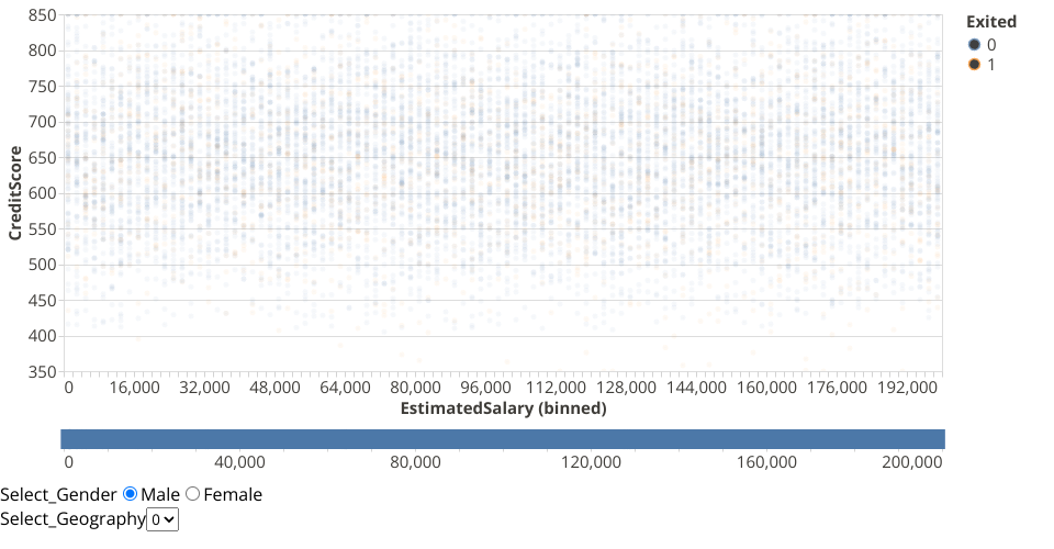
The data shown here comes from the Kaggle, via Gist.
I took help from https://observablehq.com/@uwdata/interaction?collection=@uwdata/visualization-curriculum.
You can select a range of salaries on the top graph to view that in the below graph. I have binned the salaries into 50 bins.
Additionaly, you can select which gender you want to focus on and the country the customers are from.
MIT Licensed