A visualization constructed using the vega-lite-api.
The data shown here comes from the Kaggle, via Gist.
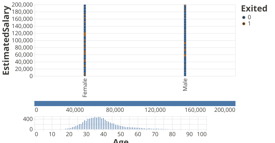
This visualization shows the salary vs gender plot for a company. Choose a salary range and you can see which customers male/female fit the given range of salaries.
You can also select the age range which you want to see.
The graph below the salary range graph is the age vs count graph where you can see the count as well for each age group.
This is of great help, With this one can see the salary for a given age group based on gender.
MIT Licensed