Life Expectancy Data:
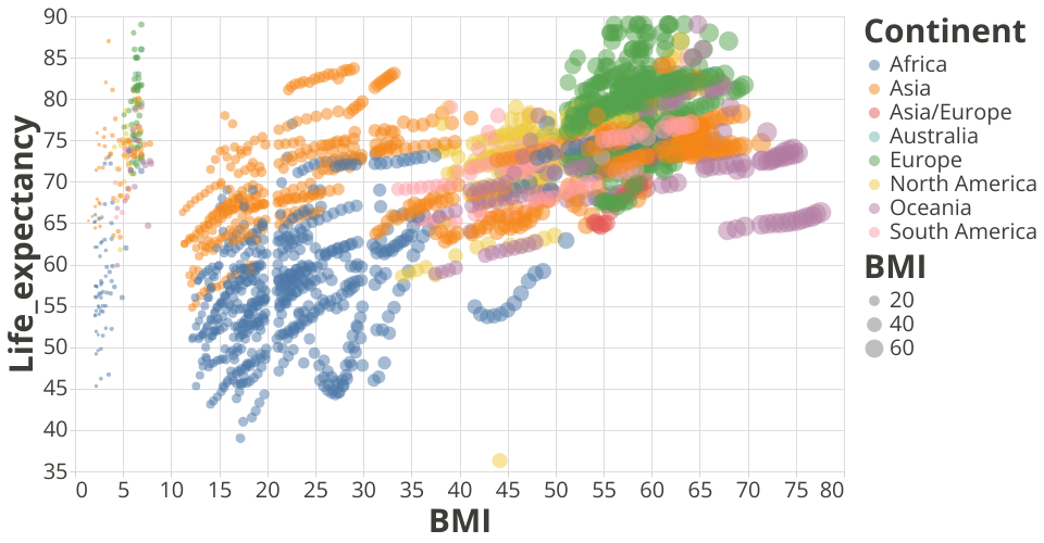
Dataset Source: Life Expectancy WHO Data uses the scatter plot visualization using vega-lite-api.
This visualization plot shows the Life expectancy of people in various parts of the world and the average BMI over a period of 15 years.
The colors represent the various continents. Size of the circle, the average BMI and tooltip displays the countries in the world.
Analysis: We can see that continents like Africa, Asia and Europe have lower BMI and that they have average or more than average life expectancy. We do see that towards the later stage, the data shows that life expectancy of Hyper Obese people (Avg BMI > 50) is more in continents like Oceania and Europe. Credibility of this information is to be further evaluated.
Note: The template was forked from Vega-Lite-API Template