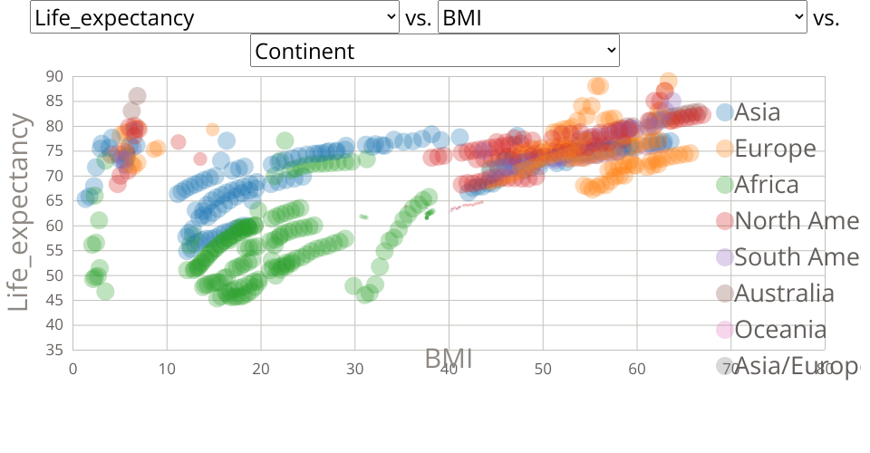
A Scatter plot with Color Menu for Life Expectancy Data.
This scatterplot takes all inputs from the data and uses these as inputs to both X and Y axes with the help of a dropdown. There is an additional menu dropdown for choosing the color as well. The correlation between each of the input parameters can be observed with the help of this scatterplot.
Note: This visualization project is a modification of the original Scatter Plot with Menus done by Prof.Curran
MIT Licensed