Life Expectancy Data:
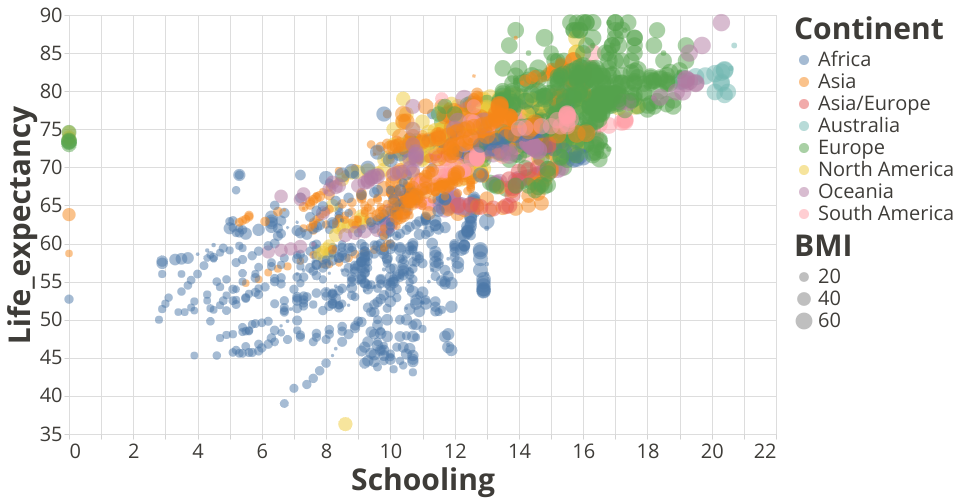
Dataset Source: Life Expectancy WHO Data uses the scatter plot visualization using vega-lite-api.
This visualization plot shows the Life expectancy of people in various parts of the world based on the number of years of schooling over a period of 15 years.
The colors represent the various continents. Size of the circle, the average BMI and tooltip displays the countries in the world.
Analysis: We can see that Africa seems to be the continent with less education and Europe displaying maximum education. We also see a linear relationship between schooling and life expectancy which seems to be fascinating.
Note: The template was forked from Vega-Lite-API Template
MIT Licensed