Life Expectancy Data:
Dataset Source:
Life Expectancy WHO Data uses the stacked area chart visualization using D3 and React.
About the Visualization and Analysis:
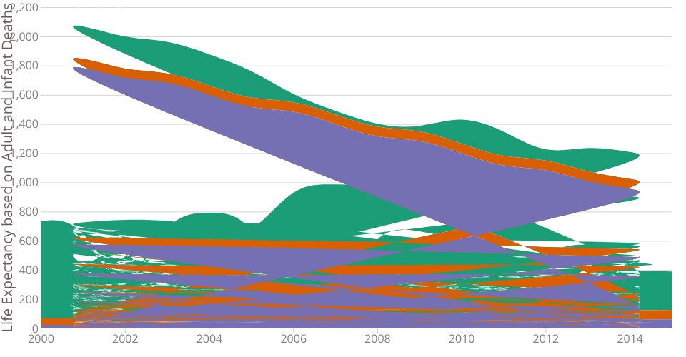
A stacked area chart of Life Expectancy Data based and Adult and Infant Deaths.
This is an effort to find the correlation between the Adult and Infant deaths to Life Expectancy for a period of 15 years. We can see that there is a multi collinearity between the three and also a clear indication that sum of deaths/year decreases as the life expectancy also decreases.
Uses d3-area-label to position labels.
Note: This area chart is forked from Professor Curran's work on CO2 Emissions Over Time
I am currently working on updating the sum with the average. I find it difficult as the count of the countries per year varies(and hence the average calculation keeps differing).