Life Expectancy Data:
Dataset Source: Life Expectancy WHO Data uses the scatter plot visualization using D3 and vega lite api. This visualization plot shows the Life expectancy of people in various parts of the world over a period of 15 years.
The colors represent the Year
Observations:
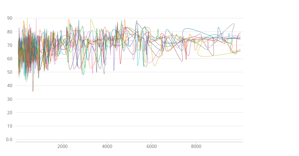
- This is the Multi-line chart showing Life Expectancy Vs GDP (3rd sketch)
- This visualization was done using D3 and React
- Moving the mouse pointer over the line displays the Year, GDP and Life Expectancy.
- I forked the original template from Internet Users by World Region done by Prof. Curran as the base to draw this graph.
- I was unable to add the legends to the axes and also combine 5 years to draw the line. Currently working on the same.
Analysis: This graph displays the correlation between life expectancy and gross domestic product (GDP) per capita. In general, countries with higher GDP have a higher life expectancy. The relationship seems to follow a logarithmic trend: the unit increase in life expectancy per unit increase in GDP decreases as GDP per capita increases.
MIT Licensed