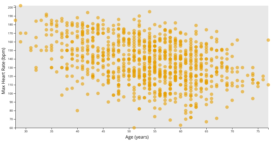
A scatter plot with D3 showing the heart-failure-prediction
The plot shows a wide distribution of maximum heart rates across different ages.
Axes:
- The x-axis represents 'Age' in years.
- The y-axis represents 'MaxHR' (Maximum Heart Rate) in beats per minute (bpm).
Data Points (Circles):
- Each circle on the plot represents an individual from the dataset.
- The position of a circle is determined by the individual's age (along the x-axis) and their maximum heart rate (along the y-axis).
Obesrvations
- By looking at the scatter plot, you can observe how maximum heart rate varies with age among the individuals in the dataset.
- The majority of the data points seem to be clustered between the ages of about 40 to 70 years.
- There are some potential outliers, such as individuals with very high or very low maximum heart rates for their age group.
- The varying opacity of the circles indicates overplotting; where data points overlap, the circles appear darker. This suggests that in the densest areas, many individuals have similar age and maximum heart rate values.
MIT Licensed