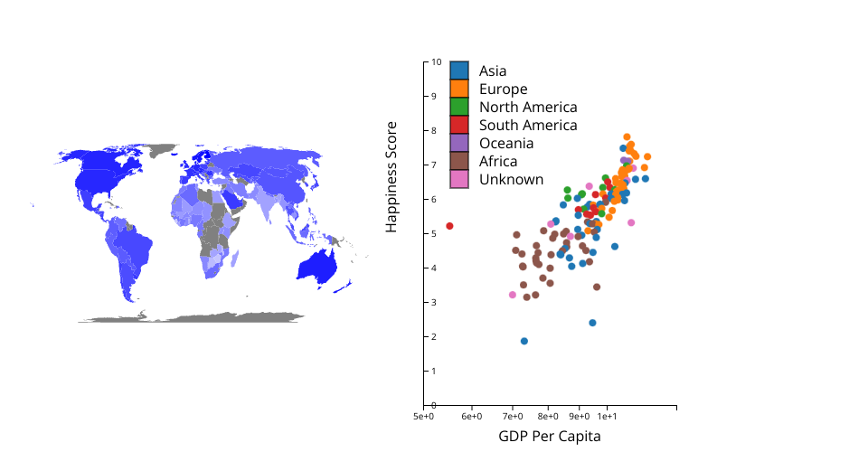
My visualization is a world map and scatter plot of happiness data. It will be part of a combined happiness/wine project. The visualization of the combined data is coming soon...
Task: What continents/countries have the highest happiness scores + how does GDP effect happiness scores.
The world map is colored coded by happiness score. The darker the color the higher the happiness score. The map also has a pop up of the country name, specific happiness score (out of 10), and GDP per Capita.
The scatter plot is linked to the map so you can see where each dot is located in the world. The scatter plot shows the positive correlation between happiness and GDP (something that the map can't show). It is color coded by happiness score.
In the future I might implement a drop down menu that can change the x-axis of the scatter plot to be different traits other than GDP. For example I have data on Social support, Healthy life expectancy, and Freedom to make life choices. It would be interesting to see how these are correlated to happiness scores.