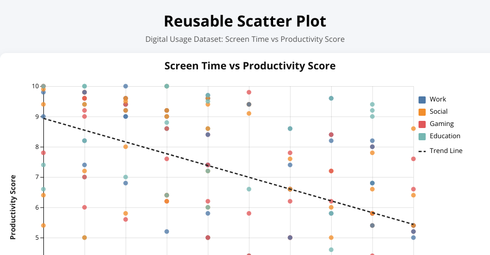
The reusable scatter plot was developed using the Digital Usage dataset to examine the relationship between screen time and productivity score. The x-axis represents screen_time_hours and the y-axis represents productivity_score, while color is used to distinguish application categories such as Work, Social, Gaming, and Education. A regression trend line was added to summarize the overall direction of the relationship, and tooltips were included to improve interactivity by displaying detailed values for each observation.
The chart suggests a negative relationship between screen time and productivity score. As screen time increases, productivity tends to decline, although the relationship is not perfectly linear. The spread of points indicates that users with similar screen time values may still have different productivity outcomes, which means other factors may also influence productivity. The reusable design is important because the same chart structure can be applied to other quantitative attribute pairs in the dataset simply by changing the input properties, reducing duplication and improving flexibility.