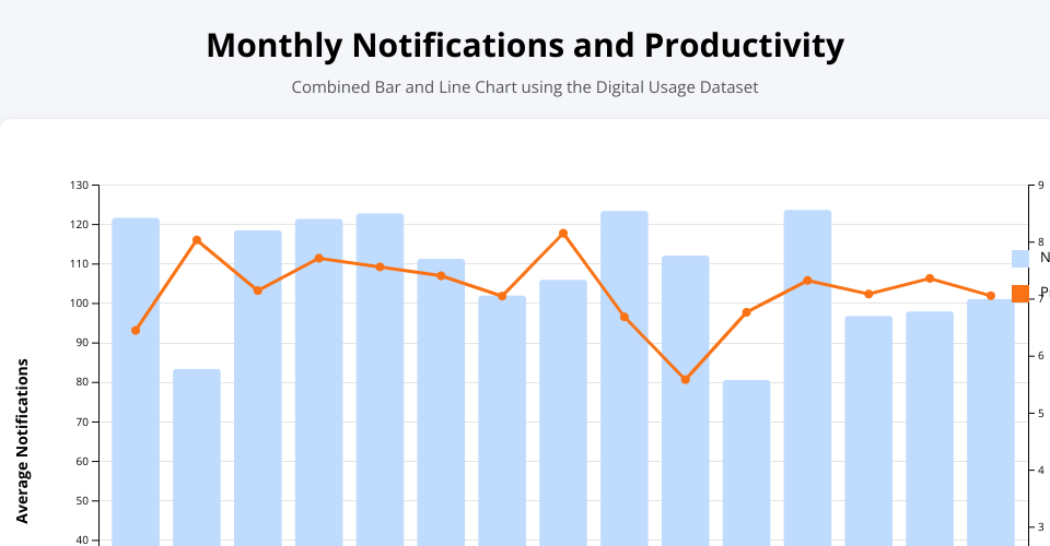
This visualization combines bars for average notifications and a line for productivity score across months. The dual-axis design makes it easier to compare notification frequency with productivity trends over time.
MIT Licensed
This visualization combines bars for average notifications and a line for productivity score across months. The dual-axis design makes it easier to compare notification frequency with productivity trends over time.