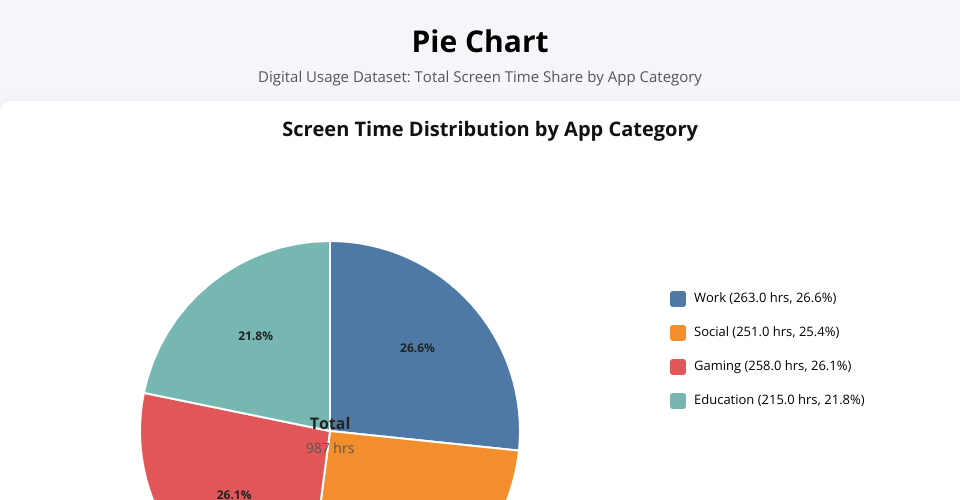
The pie chart was created using the Digital Usage dataset to represent the share of total screen time contributed by each application category. The data was grouped by app_category, and the total screen_time_hours for each category was calculated. D3’s pie layout was then used to convert the aggregated totals into slices, with percentage labels displayed inside the chart and a legend placed beside it. Additional interactivity was added through tooltips and hover highlighting to improve readability.
The visualization shows that screen time is fairly evenly distributed across the four application categories. Work, Gaming, and Social categories each account for a similar proportion of total usage, while Education contributes a slightly smaller share. This indicates that user activity is spread across multiple types of applications rather than being heavily concentrated in one category.