Forked and authored by Daniel Ribaudo.
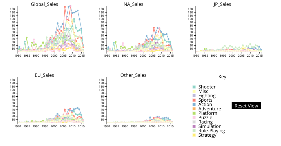
The data visualized comes from this gist: Video Game Sales
Within this dataset, there is a listing of video game sales per country. Each video game listed is labelled with a genre, year, publisher, and platform.
Functionality:
Each chart is sales for each genre of video game plotted against time. The first chart is global sales, the second is North America, third is Japan, fourth is the EU, and finally all other sales.
The key visually maps colors to each genre. Hovering over text within the key highlights the corresponding lines/circles by making them much thicker. Clicking on the next hides/shows the lines/circles corresponding to that genre.
On the technical side, the data aggregation is only done once, allowing points/graphs to be rendered much more quickly after the initial calculation.
Titles are at the top of each graph to show what sales they correspond to within the data.
The width of polylines in the line graph and circles within the line graph all scale with the current viewbox of each SVG. As the user zooms in, the lines get smaller to make values more easy to distinguish. I did this through selecting the svgs, saving each one, selecting all shapes, and finally comparing the polyline parent against the original svg selected to get the index.
The user may scroll to zoom in and out of the graphs (all updated together). Clicking and draging moves the window that the user is viewing of the whole graphs. Scrolling was improved by making it scale with current zoom. Higher zoom causes a slower scroll, so that the speed feels consistent throughout. There is a reset button that resets the scroll of all of the small multiples.
New Changes:
Instead of scaling the viewboxes of the axes, they are now redrawn with an updated domain to match the section of the graph being shown. Changing their viewport was not useful because the text became very large, and the ticks were not updated to match the granularity of the zoom.
White boxes were added underneath the axes to prevent the line graph from overlapping them as the user panned the viewing window.
Finally, guidelines were removed because they were acting like clutter, and I was unsure how to properly implement their behavior in the context of the user zooming and panning.
Things I need help with:
I would like recommentations on how to better organize my code in a javascript-friendly way. I have not needed to do this many times before in my undergraduate courses, and I know that my code is becoming very unruly.
The axes seem off, but I am unsure what the problem is exactly. The domains of the x axis should be correct, but perhaps it requires further debugging. On higher zooms, the dots relative to the ticks of the x axis are clearly desynced.
Finally, I would like an opinion on whether or not guidelines should come back, why they should or shouldn't, and ideas on how they should function in the future.
Next steps:
- Toggle graphs on and off
- Use different data (in the form of a drop down menu)
- Fix the color palette so that the yellow color is more readable (!Important!)
- Address all problems addressed in the help section
- Organize code
- Fix axes
- Evaluate guide lines