Forked and authored by Daniel Ribaudo.
This is an iterated version of my project. Because I received no feedback from students at the time I made it, I simply made several of the improvements I had listed as "Next steps"
The data visualized comes from this gist: Video Game Sales
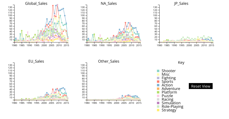
Within this dataset, there is a listing of video game sales per country. Each video game listed is labelled with a genre, year, publisher, and platform.
Functionality:
Each chart is sales for each genre of video game plotted against time. The first chart is global sales, the second is North America, third is Japan, fourth is the EU, and finally all other sales. A user may click on the graph to form a crosshair on their cursor. This functionality more easily allows points to be compared across charts.
The key visually maps colors to each genre. Hovering over text within the key highlights the corresponding lines/circles by making them much thicker. Clicking on the next hides/shows the lines/circles corresponding to that genre.
On the technical side, the data aggregation is only done once, allowing points/graphs to be rendered much more quickly after the initial calculation.
Titles are at the top of each graph to show what sales they correspond to within the data.
New Changes:
The width of guide lines, polylines in the line graph, and circles within the line graph all scale with the current viewbox of each SVG. As the user zooms in, the lines get smaller to make values more easy to distinguish. I did this through selecting the svgs, saving each one, selecting all shapes, and finally comparing the polyline parent against the original svg selected to get the index.
Axes now follow each graph. There is a parent svg which contains multiple nested svgs (yaxis, xaxis, title, and line graph). While the line graph moves its viewbox normally, specially math is used to generate the correct viewbox transformation for the other svgs.
There now is a reset button that resets the scroll of all of the small multiples.
Scrolling was improved by making it scale with current zoom. Higher zoom causes a slower scroll, so that the speed feels consistent throughout.
Things I need help with:
I would like recommentations on how to better organize my code in a javascript-friendly way. I have not needed to do this many times before in my undergraduate courses, and I know that my code is becoming very unruly.
I would like to make the axes extend forever, and scale their text. I am open for guides and suggestions on how best to do this. Additionally, I would like the increment to also increase as the axes are zoomed in on.
Finally, I would like to know how best to make the guidelines stay covering the entire screen. My first impulse is to set them to be really large, but that does not feel like a great answer.
Next steps:
- Toggle graphs on and off
- Use different data (in the form of a drop down menu)
- Fix the color palette so that the yellow color is more readable (!Important!)
- Address all problems addressed in the help section
- Organize code
- Axes scale properly and extend forever
- Guidelines extend forever