A simple scatter plot with D3 showing the 80 Cereals dataset.
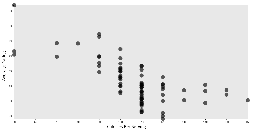
In this plot, we are comparing the calories in a single serving of each cereal rounded to the nearest 10 with the average rating given to a cereal in consumer reports on a scale of 1 to 100.
Surprisingly, this plot appears to show a general trend in which the highest-rated cereals tend to be those with lower calories! In particular, the highest rated cereal in the dataset by a significant margin is All-Bran with Extra Fiber, with only 50 calories per serving. This could show that consumers value healthiness of products, or that sugary, sweet cereals might actually be less tasty to consumers than less sweet cereals!
MIT Licensed