A simple scatter plot with D3 showing the 80 Cereals dataset.
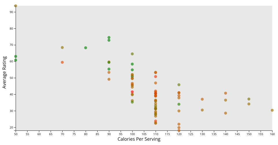
This iterates on the previous version of the visualization in two ways.
First, a color channel is introduced, interpolated between green and red. Greener data points have less sodium, while redder points had more. I was expecting to see a more linear correlation between calories and sodium, however oddly it seemed that the highest concentration of high-sodium cereals had an "average" calorie value.
Second, the user is now able to mouse over individual points on the graph to see the name of the cereal in question.
MIT Licensed