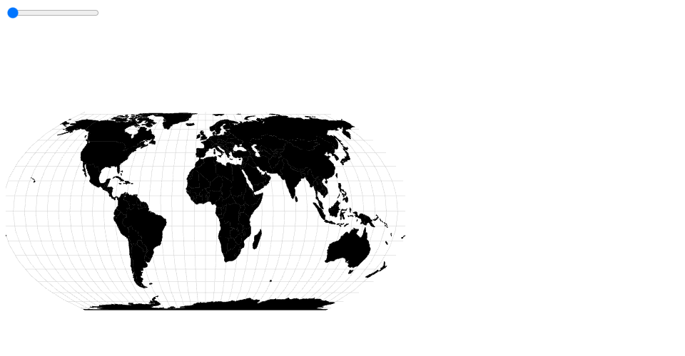
The color of each country on the map shows its GDP per capita. You can move the slider to change the year shown on the map. You can hover over a country to show its GDP over time on the plot. The red line on the plot shows the current year on the slider
Goals of viz:
- Be able to compare the GDP of countries at a given year
- Be able to see how one country's GDP changes over time
- Get an idea of how global gdps change over time by playing with slider
MIT Licensed