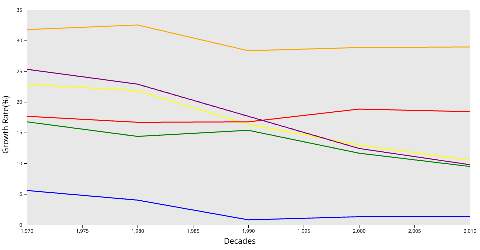
Line chart for average population growth rate of each continent. (Asia to yellow, Africa to orange, North America to green, South America to purple, Europe to blue, Oceania to red)
MIT Licensed
Line chart for average population growth rate of each continent. (Asia to yellow, Africa to orange, North America to green, South America to purple, Europe to blue, Oceania to red)