Reusable Scatter Plot for Trading Data
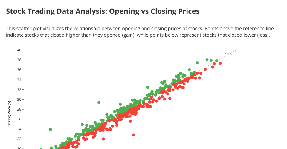
This project demonstrates a reusable D3.js scatter plot component applied to stock trading data. The visualization helps analyze the relationship between opening and closing prices of stocks.
Visualization Description
The scatter plot displays:
- X-axis: Opening prices of stocks
- Y-axis: Closing prices of stocks
- Point colors: Green for days where stocks gained value, red for days where stocks lost value
- Diagonal reference line: Shows where opening price equals closing price
Dataset Analysis
The trading dataset used in this visualization contains stock price information over multiple days. The scatter plot reveals:
Strong correlation: There is a strong positive correlation between opening and closing prices, as expected in financial markets.
Price movement patterns: Points above the diagonal line represent days where the stock closed higher than it opened (gains), while points below represent losses.
Distribution: The cluster of points shows the price range where most of the trading activity occurs.
Outliers: Any points far from the main cluster may represent unusual trading days with significant price movements.
Why Build a Reusable Scatter Plot?
Building a reusable scatter plot for trading data offers several benefits:
Flexibility: By parameterizing aspects like axes, colors, and interactions, the visualization can be adapted to different trading datasets or different financial metrics.
Consistency: Using the same component across multiple visualizations ensures consistent styling and behavior.
Maintainability: Changes to the core visualization logic can be made in one place and applied everywhere.
Efficiency: Creating new visualizations becomes faster as the component can be reused with different configurations.
Analysis: The same visualization structure can be applied to different time periods or different stocks for comparative analysis.
Usage
The scatter plot component can be customized through various getter/setter methods: