The data I propose to visualize for my project is the airline review data sourced from airlinequality.com and https://www.kaggle.com/datasets/juhibhojani/airline-reviews. I plan to visualize the overall ratings or the accomodation ratings which could be one of seat comfort, cabin staff service, food & bev, ground service, inflight entertainment, wifi/connectibity and value for money. I would like to utilize the horizontal bar chart to show these ratings per airline and make it customizable in that you can show different statistics like average, mode, etc and show by ascending or descending. I can make it more customizable by allowing the user to pick how many instances they want to show.
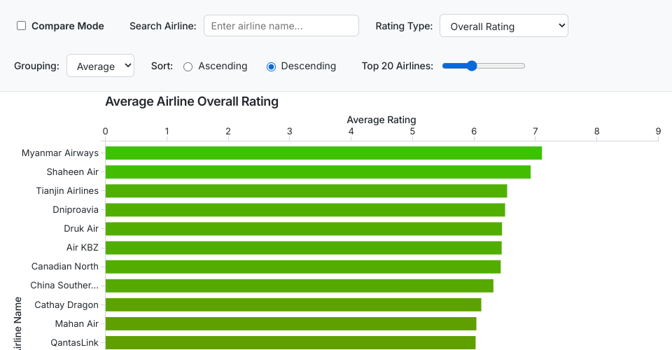
I've created a proof of concept visualization of this data. It's a horizontal bar chart and it shows the average overall ratings of the top X airlines in the world based on customer ratings. I have added the ability to sort by ascending or descending overall rating and the ability to slide a scale to choose how many airlines will be displayed at once.
Data Columns
The dataset contains the following columns:
- ID: Unique identifier for each review
- Airline Name: Name of the airline being reviewed
- Overall_Rating: Overall rating given by the reviewer (1-10 scale)
- Review Date: Date when the review was submitted
- Verified: Whether the review is verified (TRUE/FALSE)
- Aircraft: Type of aircraft used for the flight
- Type Of Traveller: Category of traveler (e.g., Solo Leisure, Couple Leisure, Business, Family Leisure)
- Seat Type: Class of seat (e.g., Economy Class, Business Class)
- Route: Flight route taken
- Date Flown: Date when the flight took place
- Seat Comfort: Rating for seat comfort (1-5 scale)
- Cabin Staff Service: Rating for cabin staff service (1-5 scale)
- Food & Beverages: Rating for food and beverages (1-5 scale)
- Ground Service: Rating for ground service (1-5 scale)
- Inflight Entertainment: Rating for inflight entertainment (1-5 scale)
- Wifi & Connectivity: Rating for wifi and connectivity (1-5 scale)
- Value For Money: Rating for value for money (1-5 scale)
- Recommended: Whether the reviewer would recommend the airline (yes/no)