SocialSight V2: MQP Data on Social Media
by. Kiara Munz
If you want a description of whats in the above viz, jump to the Results section!
Motivations: WPI MQPs and Data Viz
From August 2022 to March 2023, I was working on my Major Qualifying Project (MQP) for my bachelors degree at WPI. This project was team's attempt to describe the differences between social media. We conducted a survey asking Likert scale questions on 12 social media, then visualized the data on our website.
But! In January of 2023, I joined CS573 - WPI's data visualization course! Once I started learning about data viz, I realized the visualizations we had selected (barcharts and boxplots) were subpar. So, this project is the result of reworking visualizations of our MQP data!
Original Website: socialsight.glitch.me
Original Site Code: Github

The Data: Survey Questions Document
The link above lists all the questions asked in the survey. After determining which social media the survey participant used, we asked 26 likert scale questions on their social media.
Ex. "The platform encourages me to present an identity."
With possible choices: Strongly disagree, Disagree, Slightly disagree, Slightly agree, Agree, Strongly agree
All the social media questions were linked to a tentative framework scales (Community, Self-Expression, Discovery, and Agency) designed during the course of the MQP.
These scales are used in the Summary visualization, but did not go through rigorous data analysis, so take them with a grain of salt.
Furthermore, the questions should have been presented to representative survey participatants to verify language precision and understanding before distribution, but the results of survey are still interesting!
Proposal & Sketches

As seen above, my original proposal for this project was heavily inspired by the design for the original website, with new diverging likert scale and radar chart visualizations.
The Single View used barcharts, with a summary scale barchart hiding the individual questions, much like the current website.
The Dual View used diverging likert scales, with a summary diverging likert scale hiding the individual questions. The idea here was to show the general "lean" (ex. more agrees vs more disagrees) for each question for a quick understanding of the data.
Both of these vizzes included the captions from the original website on the side to help guide the viewers understanding.
The Summary View used a radarchart to hopefully see a general "shape" of the data. Underneath there was a large unsorted diverging likert scale of all the social media, using a dropdown to select the scale or question to view.
The Journey
My VizHub Profile has all of the visualizations I stepped through to reach this point!
I realized pretty soon that I liked fitting everything into one view with on demand changes instead of scrolling, so I took an interactive scales approach instead of collapsibility!
I also realized that a radar chart with four scales is incomprehensible, as all shapes will be some sort of diamond and comparing scales is not inutitive, expecialy when the data is so similar. Luckily, it was realtively painless to convert the radar chart into a parallel coordinates chart! The vertical baseline guides the eyes along the chart better than a radar chart.
I abandoned adding the summary scales are barcharts and diverging likert scales too, as I realized I was shaking on the proper math display the data in those formats. I relegated the summary scales to the summary viz completely.
Early versions of diverging likert scale visualizations had a red / blue color scheme instead of a orange / purple color scheme. This was changed to ensure there were no slight political affliations for american audiences! Orange / purple are low association colors, so they hopefully will not suggest any "positive" or "negative" preference for a set of answers.
Week 4 / 5: Start of a Diverging Likert Scale

Week 6: Labels for the Diverging Likert Scale

Week 7: Start of the Radar Chart

Week 8 / 9: Real Radar Chart and Interaction

Week 10: Re-Worked Radar Chart into a Parallel Coordinates Chart

Week 11: Interactive Scales!

Week 12: Re-Made Barchart with some Interaction.

Week 13 - 14: This Final Visualization!
Results
This visualization has a select page and four different use cases. Each use case page allows you to return back to the selection page and continue exploring. All use cases (except the summary page) remembers your selections for a session to make it easier to switch back and forth between visualizations!
Select Page

The select page contains buttons to navigate to the four different uses cases. On desktop, you can hover over each button to get a description of the visualization.
Summary Page: Parallel Coordinates Chart

This visualization hoped to give a quick overview of the values of different social media. Which social media encourages community connection the best? Which one is best for personal self-expression? How about the one with the best discovery features? Or the one that gives the user the most agency over their experience? But! The data used to create these value based scales did not go through factor analysis, so, for now, it is for inspirational instead of educational purposes.
The parallel coordinates chart format can reveal how the media correlate along their axises, and allows for granular comparison on each scale.
Twelve social media are a lot to take in at once, so interaction was added! Tapping on media in the legend toggles their visibility in the chart, so you can compare a smaller set of media. Furthermore, on desktop, you can hover over the scale or the chart to highlight a specific media.
Multi Page: Diverging Likert Scale Chart

This diverging likert scale chart summarizes the distribution of answers to each question. It is sorted to make it easier to understand how media stack up. Media at the top will have more "frequently" or "agree" answers (on a percentage basis), while the ones at the bottom have the opposite.
The title question selection (for this page, and the dual / single pages) leverages the Tom Select javascript library! Vanilla selections were showing all 26 questions at once, hiding the visualization and overwhelming the user (example of the old way ). This library conveniently limits the number of displayed options, and allows for searching! This should make it much easier to navigate. Huge thanks to the open source team behind Tom Select!
Dual Page: Dual Diverging Likert Scale Chart

The dual diverging likert scale chart lets you focus on comparing two social media in particular on their distribution of answers to each question.
Along with the title section, there are media selection dropdowns to chose which media you want to investigate.
Single Page: Bar Chart

This barchart visualization surfaces the number of responses to each question, and lets you investigate each media & question pair on it's own!
This part of the visualization is also on the original website, but this lacks the captions. If you are curious about my MQP group's interpretation of these bar charts, go to socialsight.glitch.me!
Future Work
Besides many of the changes that should be done for data collection (that can be found in our final MQP paper), here are some ideas I had for the future of this data visualization!
Captions: The original website has captions accompanying all the visualizations to help guide the reader. Since they are already publically avaliable, in csv format, and keyed, it would be trivial to add them to accompany the barcharts, but I am unsure whether I like the captions enough to carry them through.
Mobile Friendly Buttons: Right now, the buttons on the select page display descriptions on hover, but mobile does not have hover! I should add buttons on top of each button to view the caption.
Response Counts: Some social media had more survey participants than others. Surfacing exactly how many users responded with each response in the percentage based diverging likert scales would make confidence in the data much clearer. These numbers should be displayed on demand instead of on defualt (with hovers or clicks), as not to overwhelm the user.
New Visualizations for Weird Questions: Most questions follow the basic negative or positive leaning Likert scale format, but some do not! These questions cannot be properly visualizated with my existing diverging likert scales. Writing novel code for a handful of questions was to much work for the scope of this class, so instead I pointed users towards the single view, is bar charts can accomodate weird scales.
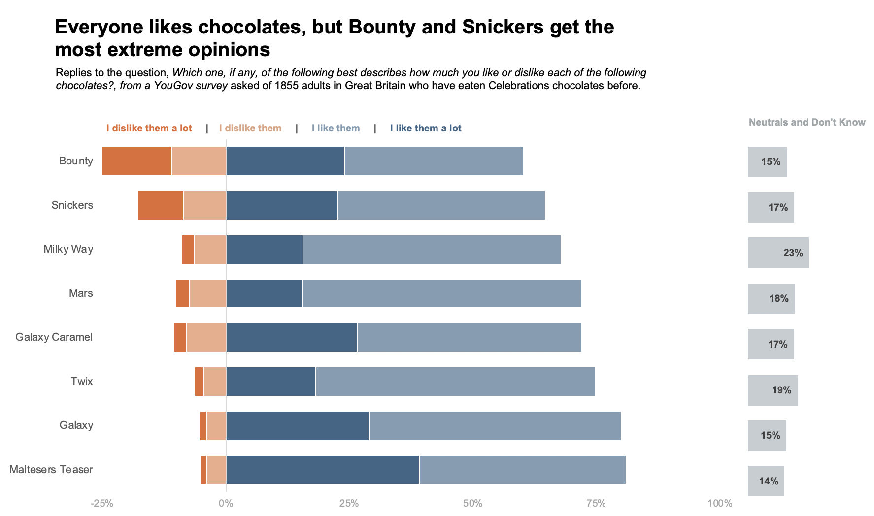
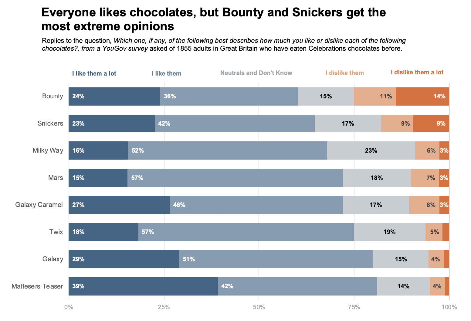
This website has some excellent alternative diverging likert scale options that could be implemented instead. The images below are from it!
- "I can control the quantity and types of advertisements I see"
Scale: (Strong Agree -> Strong Disagree) + No Ads
This question has an extra "nuetral" option that does not fit along the normal diverging scale. I would add a seperate "No Ads" bar next to the diverging likert scale like the image below
- "This platform prioritizes _____ content"
Scale: Video, Image, Text, No Priority
This question is nominal, not ordinal, so suggesting any ordering or positive/negative lean is unwise. To fit with the diverging likert scale visualization, a 100% stacked barchart could be used instead to show the responses as percentages of the whole like the image below. The "No Priority" answer could also be extrapolated out, as it is sort of "nuetral," but I would keep it in. It would likely be wise to switch up the color scheme, to reinforce that this is NOT ORDERED like the other questions.
- "On average, how long do you spend in a single session on the platform?"
Scale: <10 Min, ~30 Min, ~1 Hr, >1 Hr
This visualization could work with the existing diverging likert scale. It is ordinal, and the lean could suggest "short" versus "long" session length platforms. The only changes necessary would be to allow a scale size of 4 instead of the current default of 6!
Credits
Thank you to the Tom Select library that runs the searchable title selection!
Thank you to Curran Kelleher for a wonderful course!
Thank you to Carlie Flanagan for being a great partner during the MQP! Here is our paper :)