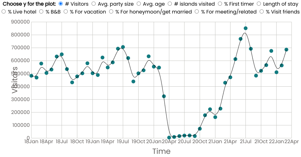
This is the interactive section of the GR 5293 project. The plots present the time series data from Jan. 2018 to March 2022 about Hawaii's monthly visitor number, average party size, or other options shown on the top. Users can click on different buttons to receive different time series plots. We believe this interactive plot is a good supplement to our third question reasearching on the impact of the pandemic and the trends or seasonalities related to time.
In our static plots about time series, we already discovered the influence of the pandemic to visitor number and expenditure. But none of the static plot is as clear as this one to show the Covid impact on the Hawaii tourism from different perspectives. It is very interesting to find that some indicators are influenced by the pandemic for just several months, while some others are influenced for more than a year. And most indicators had a huge decearse during that period, while others had a increase instead. There are easy logics behind those phenomena. If you can combind the features of those indicators to others and the real world, you may try to explain the logics. For example, we can find that the Covid caused a huge decrease in the number of people traveling. As a result, the percentage of people coming for visiting friends increased. Those people are more likely to live in their friends' home instead of hotels or bnb, which explains their decrease.
Just notice those indicators are all related. Hope you can explore this plot and think about it in deep.
Data source: Hawaii tourism data.