Description:
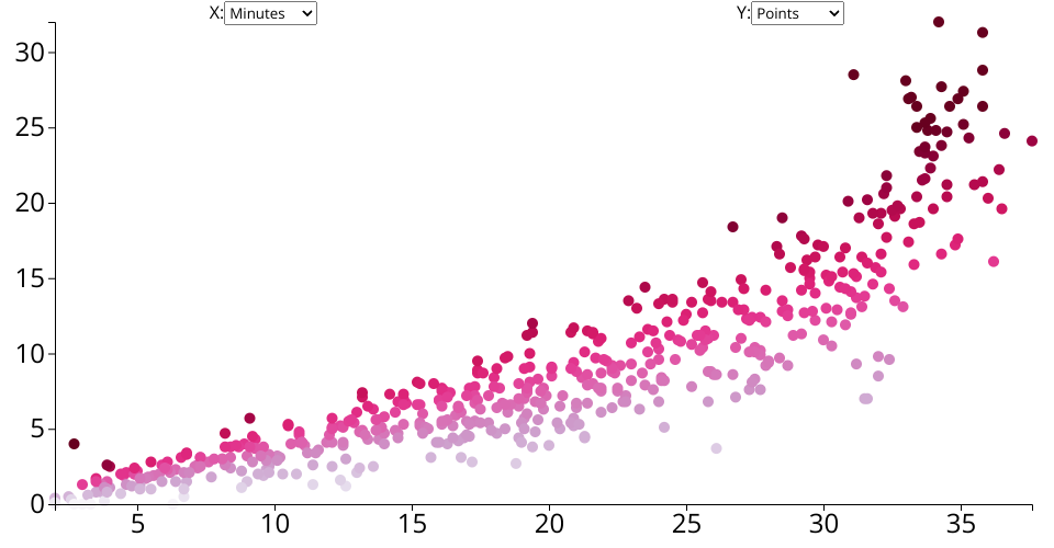
The scatter plot visualizes the NBA Player State Dataset. It is designed to depict player's scoring efficiency.
Representation:
- X-axis: Minutes played
- Dots: Each dots represents a player. Darker color represents higher efficiency.
What's new:
- Added a dropdown meun interaction to the y-axis representation.
- Added the hover interaction to dots. It shows the player's name when your mouse is on the dots.
MIT Licensed