This visualization was constructed using the vega-lite-api. It was originally forked from one of Curran Kelleher's Vega-Lite API templates and modified to include Television Show Rating data which originates from R for Data Science's Tidy Tuesday weekly event for January 8, 2019.
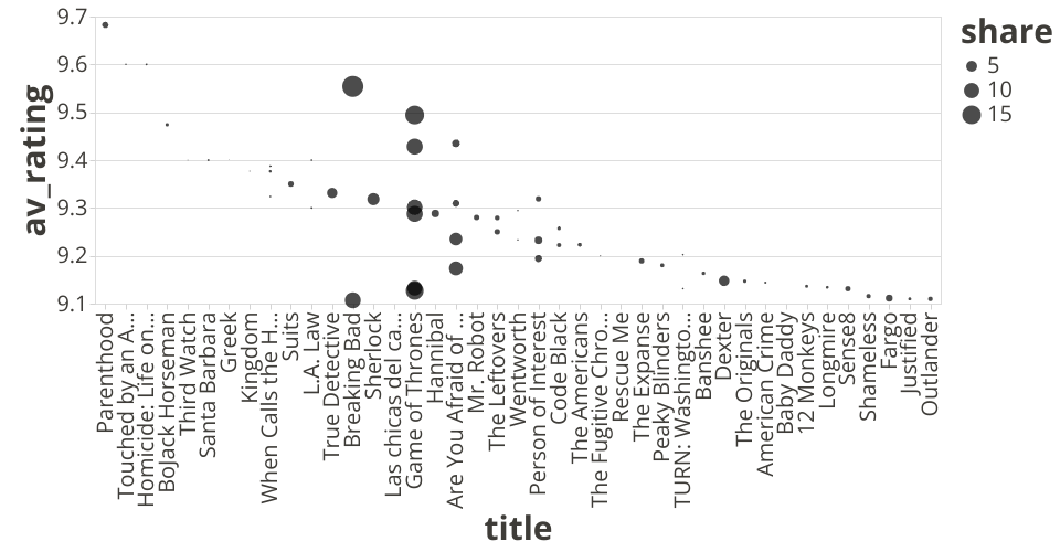
This chart shows Average Rating by Television Show. It's sorted by average rating, and it also represents the rating share with point size. For readability and to focus on the highest ratings, the chart does not show average ratings below 9.1, though I would want to change how that is expressed with later visualizations, especially as this chart does not tell the whole story for a single television show.
Some quick understanding can be drawn from the displayed data, particularly for shows with multiple highly-rated seasons. Game of Thrones has both many highly-rated seasons and seasons with higher share. Breaking Bad and Are You Afraid of the Dark? are next in both regards, and it's fascinating to see how two very different shows have similar results. With some exceptions, most of these data points are showing "one-season wonders," as the lack of other data points implies the show had inconsistent ratings or did not run for more than one or two seasons.
In later visualizations, I would like to start incorporating a show's genre to see how it plays a role in these comparisons.