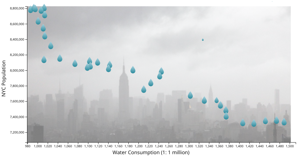
A simple scatter plot with D3 showing the Water Consumption in the City of New York Dataset, modified so the points are water droplets.
MIT Licensed
A simple scatter plot with D3 showing the Water Consumption in the City of New York Dataset, modified so the points are water droplets.
Comments
Amazing! Might it make sense for the droplets to be going down rather than up? Excellent work!
Beautiful!
Thank you both! I made the droplets fall down rather than up since it makes more intutive sense. What do you two think about the image of NYC in the background, does it make sense or are images usually not that great as a background in visualizations?
I really like it! One idea that might work well with the image is to fade it to the background a bit, which could be done by tweaking the opacity or adding a semi-transparent rectangle over it.
In my opinion, the more pressing question is, what does each droplet represent? Tooltips would be awesome here. Upon closer inspection of the data, it appears that each droplet represents a year. In this case, it may be useful to show the year using color of the droplets. This data also affords a connected scatter plot, where you could draw lines between adjacent years (although that might not work with the droplet concept).
Also, the trend itself is counterintuitive. Why would total water consumption decrease as population increases? Am I reading that right?
One more thing, it seems you have inverted time, which is somewhat confusing. It might work to add the drops in the ordering of the years, starting with the oldest, and perhaps flash the text of what year it currently is in a fixed location like in the top center.
Overall I'm really impressed at how well this is coming along! The imagery adds a lot.
Thanks for the feedback Curran, I greatly appreciate it!
I really just had a simple idea to replace the points with water droplets since the graph represents water consumption based on population currently, but it's evolved into a more interesting iteration. Do you think it would be better to instead have time on the X-axis and water consumption on the Y-axis?
And yes, I know it looks counterintutive, but water consumption decreased as population increased (and since population usually increased over time, water consumption hence decreased over time). It's mainly due to the city spending billions of dollars over decades on water system optimizations, along with conservation efforts in tandem with efforts towards user consumption reductions. This reddit comment gives some more insight: https://www.reddit.com/r/dataisbeautiful/comments/9tzmkp/comment/e90h56c/
When I get some time I definately will add tooltips since that will help inform users of each datapoint as well.
This isn't related to my final project, but I'm definately enjoying the process to create and make these types of visualizations more appealing, so I look forward to the feedback and hopefully can continue to do this kind of work in joy even after I finish the class and be able to see the great work in the community!
Actually I did think about the question "What visualization method would make this data the most clear?", and I think what I would try is actually a totally different visual form, where there are two separate line charts, one for population and another for consumption, where they are positioned on top of one another and share the same X axis, which represents time.
BOOM! There's an interesting story right there! This opens up lots of directions, like pulling in data about how much the city spent on those optimization efforts over time. It would also be interesting to look at the same data for other cities and see how it compares.
Funnily enough, I had created a multi-line chart from feedback I got from someone else describing what you are talking about: https://vizhub.com/vspatel927/ba197fe4d2a04b7585884f8e5b96a55c
So I have multiple different directions to work on this viz with, very fascinating. Thanks for the feedback Curran!