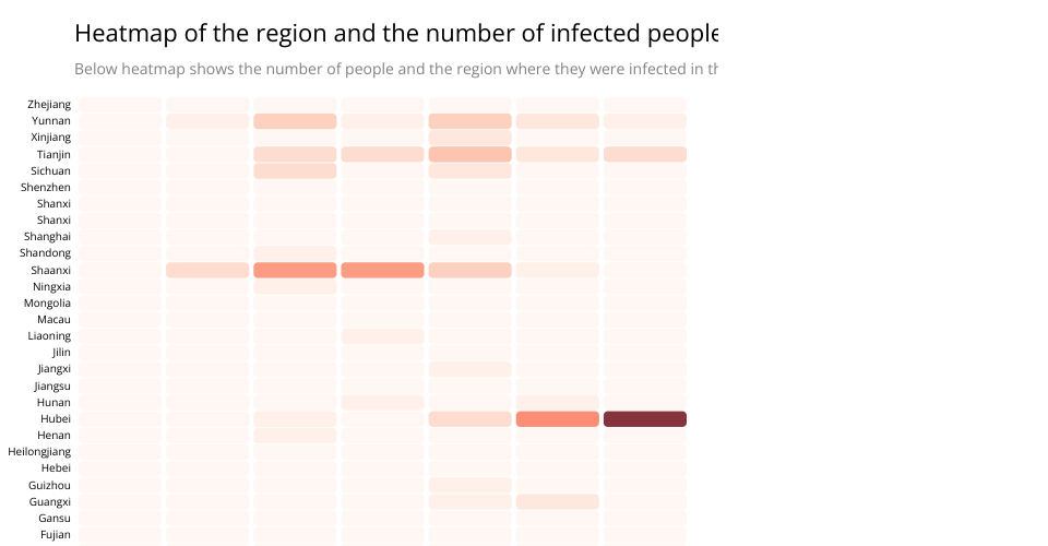
This visualisation was implemented to show the rate of spread between people in the early stages of the outbreak. as we can see the heatmap is an interactive heatmap that shows the number of people at the bottom of the heatmap.
From analysis we can see that the provinces of Hubei and Shaanxi were hit very badly with maximum number of cases arising from tha part. and most of them in the age group of 66+ years.
This was made for the data visualisation project by varun nangia
MIT Licensed