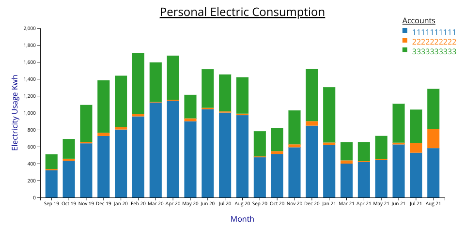
A bar chart visualization of my personal electricity consumption dataset. I live in a three family structure and occupy two floors. There is also a common account that supplies the front and back hall lighting as well as the basement and exterrior outlets. It covers a period of two years.
I forked https://vizhub.com/RED98310/a3ea8fbec4b64423a7797a418de4af57?edit=files and stated with that code. I also looked at Most basic stacked barplot in d3.js for how to render the stacked barchart.
I made the following changes from the one last week
- Changed the code to use d3.stack. There was a bug in the previous week bar chart since it wasn't showing account number 2222222222.
- Changed the y axis label to be along the axis and vertical instead of horizontal and at the top to make room for the title.
- Changed the colors to green and blue. I thought they were less jarring.
- Cleaned up the code by grouping calculation of data with the code that added it to the visualization.
- Added a title to the accounts legend per feedback on slack.
Next steps
- Show a tooltip at the top of the bar amount when hovering over.
- Wrap the bar graph around a circle that is a 12 month period.
Unfortunately, I deleted the graph that I started with as part of cleaning up my profile then realized I should have kept it and forked from it per the instructions of the assignmnet. I believe I have captured all the changes.
version 1.3