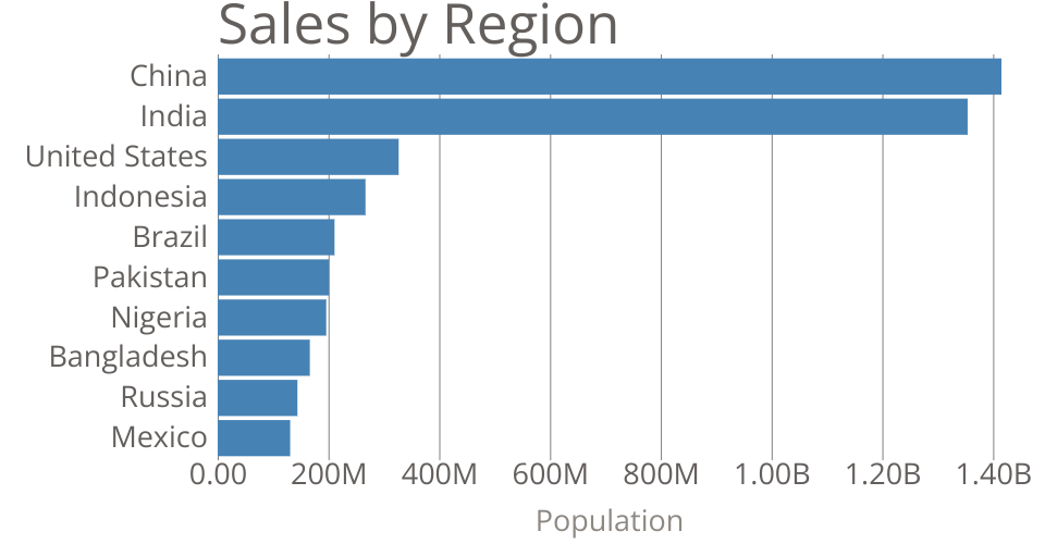
This bar chart shows population of the top 10 most populous countries. The data comes from the year 2018 estimate in United Nations: World Population Prospects 2017. It also demonstrates customization of D3 axes.
See also the first bar chart visualization that this one builds on: Making a Bar Chart.
MIT Licensed