A visualization constructed using D3.
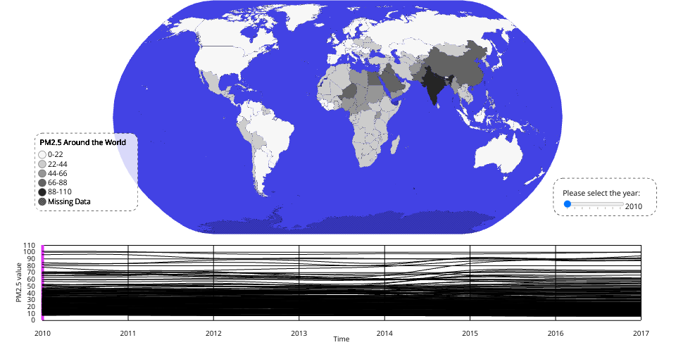
The data shown here comes from the Kaggle:PM2.5 Global Air Pollution 2010-2017 (Mean Annual Exposure for 240 Countries) via Gist: PM2.5 Global Air Pollution Dataset (From 2010-2017)
The data is processed and melt to fit the visualization. It realize a Choropleth Map of the world to show the PM2.5 value in a specific year and the distribution around the world.
A slider is realized for user to select the year shown on the map and the purple line in the line chart shows the selected year.
The World Map can zoom in and out to make the perfect view for the user.
If the mouse is move on a specific country the country would be highlighted with red color and the related data in the line chart can also be highlighted.
If the user click on a specific country on the map the, there would be a highlighted view for the user to see the data for the specific country. The user can click again to quit the view.