This is a stacked bar chart visualization of the dataset Nuclear Explosions.
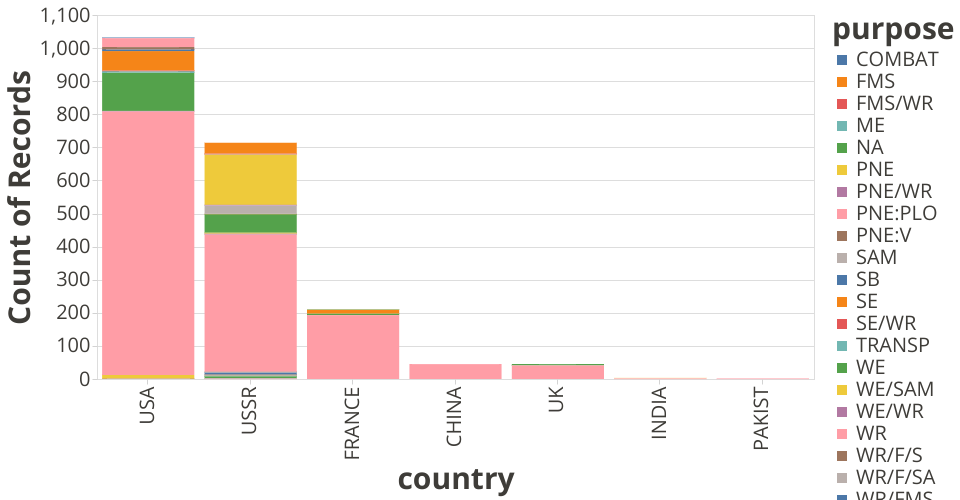
I originally had a sketch of a simple bar chart to compare the number of deployments by each country. I decided to visualize this and then add the purpose of each deployment. So here, we have a stacked bar chart that shows how many nuclear explosions each country deployed and why. As we can see, USA has deployed the most nuclear bombs. We can also see that most of the deployments (for all the countries) were for weapons development (WR).
This visualization answers the following questions:
- Which countries deploy the most nuclear devices and how do they compare to each other?
- Why are nuclear devices being deployed and does the reason change per country?
The questions that this visualization does not answer are those that include time and location. I am thinking that a nice map could help with locations and maybe a slider to show what happens over time.