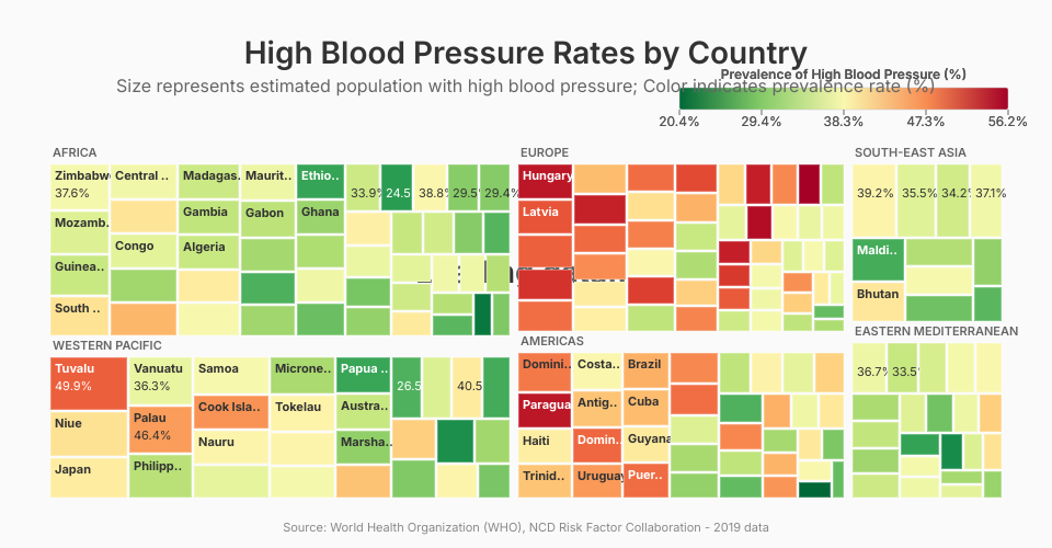
Prompt for VizHub AI: Objective: Create an interactive treemap visualization of global high blood pressure rates using the provided dataset. The final visualization should be clean, informative, and stylistically similar to the Voronoi app example.
- Chart Type:
Use a Treemap. 2. Data Mapping:
Rectangle Area: The area of each rectangle must be proportional to the total number of people with high blood pressure in each country. Use the data from the [column_with_total_number_of_people_with_hbp] column for this. Rectangle Color: The color of each rectangle must be determined by the prevalence rate of high blood pressure. Use the data from the [column_with_prevalence_rate] column for this. 3. Color Scale:
Apply a sequential color scale. Low prevalence rates should have a light, low-intensity color (e.g., light yellow or pale green). High prevalence rates should have a dark, high-intensity color (e.g., deep orange or dark red). The color transition should be smooth and clearly represent the gradient from low to high. 4. Labels:
Inside each rectangle, display two pieces of information: The country name, from the [column_with_country_name]. The prevalence rate, from the [column_with_prevalence_rate], formatted as a percentage with one decimal place (e.g., "28.1%"). Ensure the label font is legible. Automatically use a contrasting text color (e.g., white text on dark-colored rectangles and black text on light-colored rectangles). 5. On-Chart Elements:
Main Title: Set the title to "High Blood Pressure Rates by Country". Color Legend: Add a clear legend that explains the color scale. The legend should be titled "Prevalence of High Blood Pressure (%)" and show the range of values from low to high. Source Information: At the bottom of the visualization, add a source credit: "Source: World Health Organization (WHO), NCD Risk Factor Collaboration". 6. Interactivity (On Hover):
When a user hovers their mouse over any country's rectangle, display a tooltip with the following details, clearly labeled on separate lines: Country: [country_name] Prevalence Rate: [prevalence_rate] (formatted as a percentage) People with HBP: [total_number_of_people_with_hbp] (formatted with commas for thousands) Example Summary:
"I want a treemap where each box is a country. The size of the box should show the total number of people with high blood pressure, and the color should show the percentage rate. Label each box with the country and its rate. Add a title, a color legend for the rates, and a source credit. When I hover over a box, show me a tooltip with all the details."
Why this prompt works:
Explicit: It leaves no room for guessing. It specifies the chart type, what each visual element represents, and what the text should say. Structured: It breaks down the request into logical parts (Data Mapping, Labels, Interactivity), which is how a data visualization is constructed. Data-Specific: It uses placeholder column names like [column_with_country_name], which prompts you to map them to your actual data file, ensuring accuracy. Comprehensive: It covers everything from the core chart to the small but important details like the source credit and tooltip formatting.