US Airline Accidents Visualization
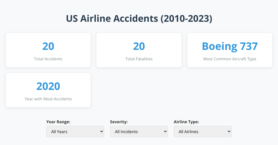
This project displays an interactive visualization of airline accidents in the United States from 2010-2023 using D3.js. The visualization includes geographic distribution, timeline analysis, and contributing factor breakdowns.
Features
- Interactive map showing the locations of airline accidents across the US
- Timeline visualization showing accident frequency and severity over time
- Bar chart breaking down accidents by contributing factor
- Filter options to explore data by year range, severity, and airline type
- Key statistics summary
- Responsive design that works across different screen sizes
Data Source
The visualization uses sample data modeled after information from the National Transportation Safety Board (NTSB) Aviation Accident Database. In a production environment, this would be replaced with actual data from the NTSB or similar aviation safety organizations.
Technologies Used
- D3.js for data visualization
- TopoJSON for US map data
- JavaScript for interactivity
- CSS for styling
Getting Started
- Clone the repository
- Open index.html in your web browser, or set up a local server
- Interact with the visualizations to explore airline accident data
Insights from the Visualization
- Geographic clusters of accidents in major air travel hubs
- Timeline patterns showing seasonal trends in accident rates
- Breakdown of contributing factors showing the primary causes of accidents
- Differences between fatal and non-fatal accident distributions
Future Enhancements
- Integration with live NTSB data API
- Additional visualization types (aircraft type breakdown, airline comparison)
- More detailed filtering options
- Predictive analytics for accident risk factors
MIT Licensed