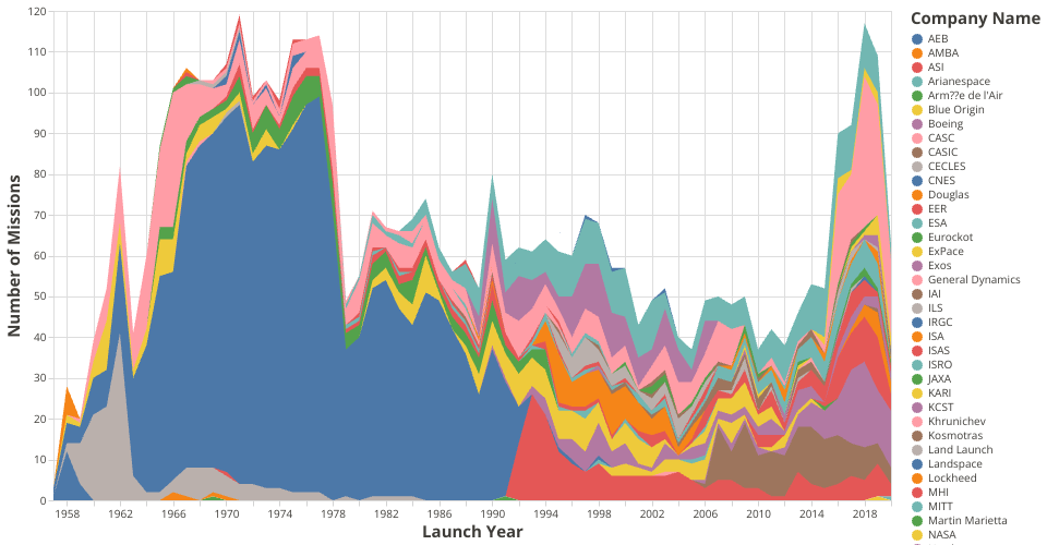
This Stacked Area Chart shows the number of launches per year ranging from 1950 to 2020 where each company is represented by a different color and the number of launches are shown as the tooltip on hover. The visualization is constructed using the vega-lite-api.
The data shown here comes from here.
MIT Licensed