This visualization is part of the wine/happiness project. This visualiztion focuses solely on wine, while other will focus on solely happiness and the two datasets combined.
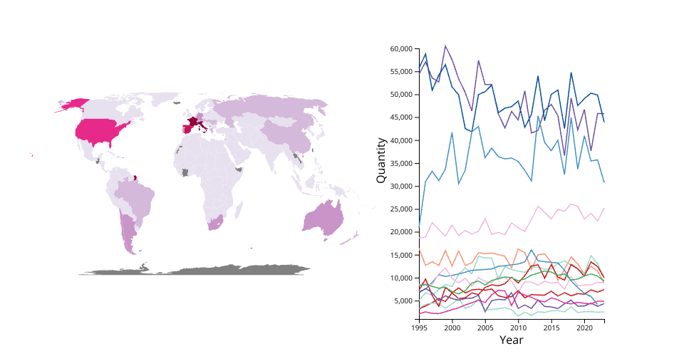
Task: Which areas of the globe produce the most red wine? How have the top wine producing countries changed/emerged over time?
Features working: Can mouse over countries on the map to see the amount of wine they produced for the most recent year with recorded data (either 2022 or 2023).
TODO: 1. Filter out the most "relevant" countries to display in the line chart (complete line chart can be seen at https://vizhub.com/lpenrice/18fd25a1152f40f0945bb58612cac57d?file=index.js). 2. Link the map and line chart so that a particular country's line becomes highlited and its production over time can be easily observed. 3. Fix axis labels (Year is displayed on the X).
Ben's resources because this is a fork of his work: A bare minimum HTML page demonstrating use of CSS and JavaScript.
See also React Starter.