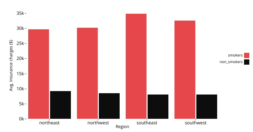
A clustered bar chart using D3 displaying data of insurance charges from the Insurance Expenses Dataset.
The region where the customers live is displayed on the x-axis, the average insurance charges in dollars on the y-axis and their smoking status on the color of the bars (black if they don't smoke or red if they do).
MIT Licensed