What's new?
- New selection of colors for the bars.
- More subtle axis ticks and labels.
- New tooltip when hovering over a bar with the number of records and totals used to calculate the average.
- Bars are highlighted when hovering over them.
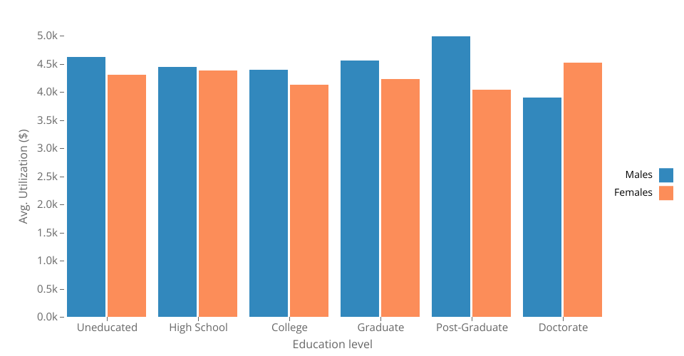
A clustered bar chart using D3 displaying data of credit card utilization from the Bank Customers Dataset.
The education level of the customers is displayed on the x-axis, the average utilization in dollars on the y-axis and their gender on the color of the bars (blue for males or orange for females).
MIT Licensed