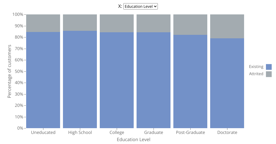
Stacked bar chart using D3 displaying data of attrition level by different categorical variables from the Bank Customers Dataset.
The menu at the top enable the users to choose which categorical columns to use. The options are:
- Income Level
- Education Level
- Marital Status
- Card Category
- Gender
Finally, the attrition status of the customers is encoded on the color of the bars, the users can highlight the bars by hovering over the legend values and see the exact percentage value by hovering over each individual rectangle.
MIT Licensed