This visualization was constructed using the D3 & React.
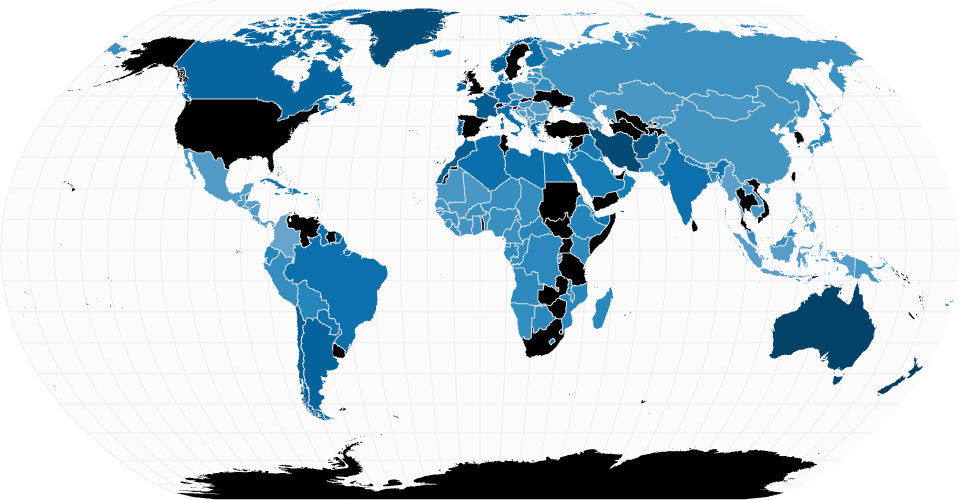
The idea behind this visualization is to analyze how the percentage of the world population that suffers from a mental illness has varied over the years. In this case, a Choropleth map allows me to better analyze the change in the percentage of the world population over the years, and allows me to answer questions such as:
Questions I wanted to answer with this visualization
- How has the percentage of mental diseases in each country changed over time?
- Has there been a decrease in people with mental illnesses, or rather an increase?
The data used in this visualization can be found here:
- Mental Healths Disorders Dataset
- Country boundaries from World Atlas TopoJSON, polished for visual style, including graticules.
MIT Licensed