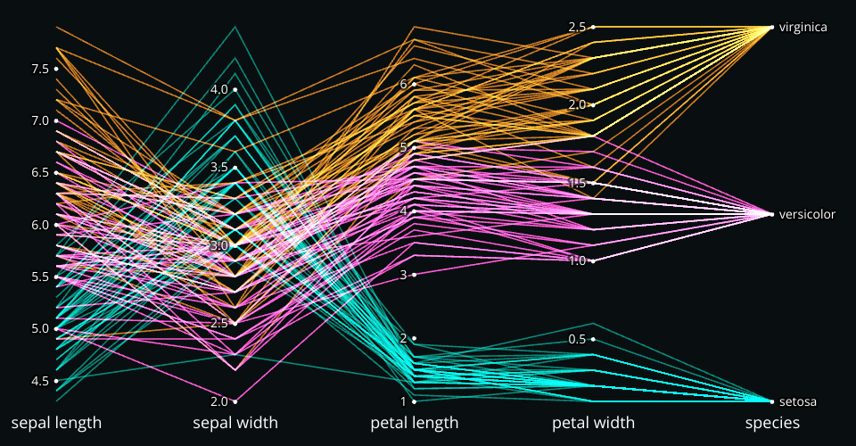
A parallel coordinates plot with brushing, multidimensional filtering, and responsiveness. Shows the Iris Dataset.
Also a test case for exporting code out of VizHub and into a Vite project! See also vite-export-template
Inspired by:
- https://observablehq.com/@d3/parallel-coordinates
- https://observablehq.com/@d3/brushable-parallel-coordinates
- https://observablehq.com/@d3/ordinal-brushing
Creating Interactive Parallel Coordinates with D3
In this tutorial, we'll explore creating interactive parallel coordinates using D3.js. This visualization technique is perfect for multi-dimensional data exploration. We'll dive into key aspects like scales, line generators, and interactive brushing.
Setting Up the Environment
We start by importing necessary D3 modules and defining a helper function to adjust color hues:
import {
  select,
  scaleLinear,
  scalePoint,
  scaleOrdinal,
  schemeCategory10,
  extent,
  line,
  brushY,
  axisBottom,
  hcl,
} from 'd3';

const hueShift = (hueDelta) => (color) => {
  const newColor = hcl(color);
  newColor.h += hueDelta;
  return newColor.hex();
};
The hueShift function is a higher-order function that
takes a hueDelta parameter and returns another function.
This inner function takes a color parameter, applies a hue
shift based on the hueDelta, and returns the resulting
color in hexadecimal format. Here's a breakdown of its
components:
Higher-Order Function:
hueShiftis a higher-order function because it returns another function. ThehueDeltaparameter is used to specify how much to shift the hue of the color.Inner Function: The inner function takes a
colorparameter, which is expected to be a color string that can be understood by D3'shclfunction (e.g., a hexadecimal color string).Color Conversion: The
hclfunction from D3 converts the inputcolorstring into an HCL (Hue, Chroma, Luminance) color object. HCL is a cylindrical color space that is similar to HSL and HSV.Hue Adjustment: The hue component (
h) of the HCL color object is incremented byhueDelta. This effectively shifts the color's hue by the specified amount, wrapping around if necessary.Hexadecimal Conversion: Finally, the modified HCL color object is converted back to a hexadecimal color string using the
.hex()method, and this string is returned as the result.
We use this later to add some flair to the default colors.
Defining Scales
We need to set up scales for our X and Y axes. For the
X-axis, we use a scalePoint to evenly space our
dimensions. For the Y-axes, we choose between scaleLinear
and scalePoint based on the data type of each dimension:
const xScale = scalePoint()
  .domain(columns)
  .range([marginLeft, width - marginRight]);

const yScales = {};
for (const column of columns) {
  yScales[column] =
    columnTypes[column] === 'quantitative'
      ? scaleLinear()
          .domain(extent(data, (d) => d[column]))
          .range([height - marginBottom, marginTop])
      : scalePoint()
          .domain(data.map((d) => d[column]))
          .range([height - marginBottom, marginTop]);
}
Setting Up Color Scale
We use D3's scaleOrdinal to assign colors to our lines.
The hueShift function adds a bit of flair to the default
color scheme:
const colorScale = scaleOrdinal()
  .domain(data.map(colorValue))
  .range(schemeCategory10.map(hueShift(-74)));
Rendering Lines
We use D3's line generator to create paths for each data
point. The X position is determined by the dimension, and
the Y position is based on the data value. Here's a
simplified version of the full logic that highlights how the
lines are computed:
import { line } from 'd3';
const lineGenerator = line();
selection
  .selectAll('path')
  .data(filteredData)
  .join('path')
  .attr('d', (d) =>
    lineGenerator(
      columns.map((column) => [
        xScale(column),
        yScales[column](d[column]),
      ]),
    ),
  );
Note that we do not configure lineGenerator, so it uses
the default X and Y accessors, which assume that each datum
defines coordinates as [x, y] arrays. This is why we can
map over the columns and return such arrays that define our
desired coordinates. The X coordinate is computed by the X
scale, whose domain is the list of columns. The Y coordinate
is computed by the Y scale associated with the current
column, which maps data values for that column to vertical
positions.
Adding an X-axis
We add an X-axis to label our dimensions. The axisBottom
function from D3 makes this easy:
selection
  .append('g')
  .attr('transform', `translate(0,${height})`)
  .call(axisBottom(xScale));
Main Function
Finally, we tie everything together in a main function that
sets up the SVG element and calls our parallelCoordinates
function:
export const main = (container, { state, setState }) => {
  // Logic omitted for computing dimensions updateBrushedInterval.

  // Set up the SVG.
  const svg = select(container)
    .selectAll('svg')
    .data([null])
    .join('svg')
    .attr('width', width)
    .attr('height', height)
    .style('background', '#090F10');

  // Invoke the parallel coordinates.
  svg.call(parallelCoordinates, {
    data,
    columns,
    columnTypes,
    colorValue,
    idValue,
    width,
    height,
    brushedIntervals,
    updateBrushedInterval,
  });
};
Here, we set up the SVG, and invoke our parallel coordinates function.
Conclusion
Parallel coordinates are a powerful tool for visualizing high-dimensional data. By leveraging D3.js, we can create interactive and customizable charts that offer deep insights into complex datasets. This tutorial provides a foundation for building more advanced visualizations with additional features and interactions.
Challenge
Fork this viz and modify it to show your own data!
Comments
that's really neat; As the agriculture community could use it, for instance to how various types of wheat, corn and soybeans have evolved over a period of one or two decades; Although I'm not sure how and where the temporal scale would fit in....
Oh yeah for sure! This is super versatile. I bet it would work well for agricultural data. Time could be plotted here as just another parallel axis. Do you have a datasets in mind?
Here's an amazing older example of food nutrients in an interactive parallel coordinates plot:
https://blocks.roadtolarissa.com/syntagmatic/05a5b0897a48890133beb59c815bd953