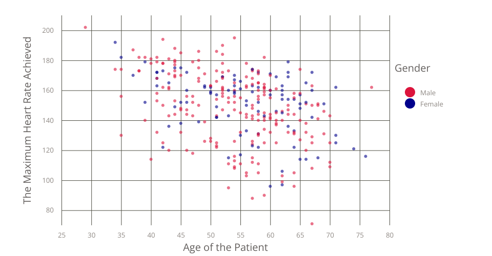
This is a scatter plot about how the age of the patient affect the maximum heart rate in the dataset. The original dataset comes from Kaggle Dataset: Heart Disease UCI
This visualization shows The Github Gist: Heart Disease UCI
The XAxis represents the age of a certain patient The YAxis represents the maximum heart rate achieved.
In the Legend, red and blue color represent the gender of patient
This is the iterated work forked from Heart Disease Scatter Plot.
I made several changes learned from Vizhub: "Stylized Scatter Plot with Color Legend"
- I added gridlines on X and Y axis to make the plot more readable.
- The 'Sex' attribute in dataset is transfered into string ['Female','Male'].
- Color Legend is added to the plot for illustration.
MIT Licensed