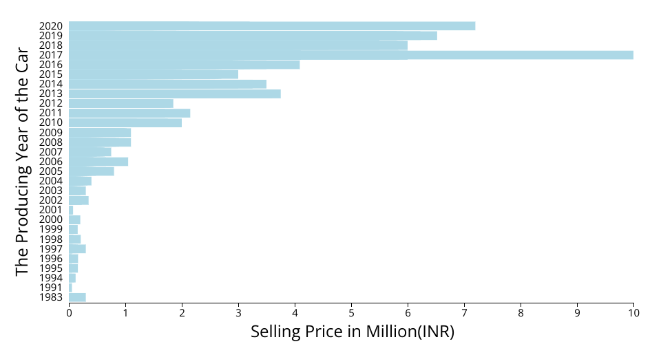
This is a bar chart about how the car's selling price corelated to it's producing year. The original dataset comes from Kaggle: Vehicle Dataset
This visualization shows The Github Gist: Car Selling Details
The XAxis represents the car's selling price in Indian currancy - INR The YAxis represents the producing year of a car in the dataset. This attribution is sorted from the original data.
MIT Licensed