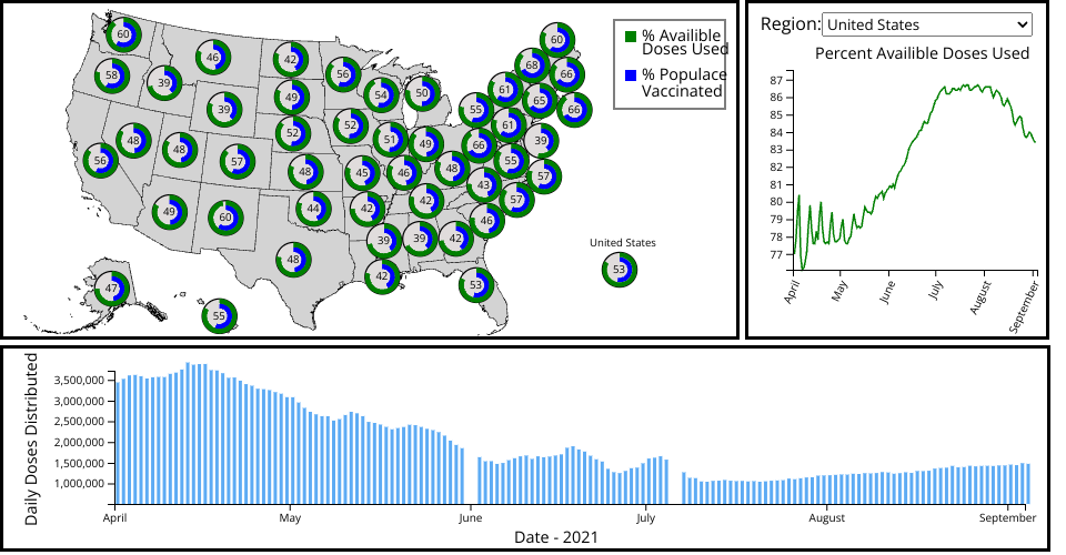
A dashboard showing COVID-19 Vaccination doses administered in the United States.
The lower bar chart is the daily number of doses administered for a given region. The map shows the number of daily doses administered in every state as of the latest data, and the right line char shows the percent of availible vaccine doses which have been administered for the selected region. By brushing the bottom barchart you can select the data for the map and line chart to visualize, with the circles representing the number of doses administered in each state on the date at the end of the selected date range. To select a region for visualiztion either use the dropdown or click on a region in the map.
Clicking the "United States" marker in the lower right of the map will show the aggregated national data in the bar and line charts.
Data Source: US Vaccination Data by State/Territory
Part of a larger visualization project by Peter VanNostrand