Data: https://gist.github.com/Junying-Li/72ef4641efd6b4abf371f5d9f4267a56
Iterated from last week's visualization.
What's new?
- Added buttons to interact with users.
- When click on a button, the bar chart will filter and sort data.
- Added transition.
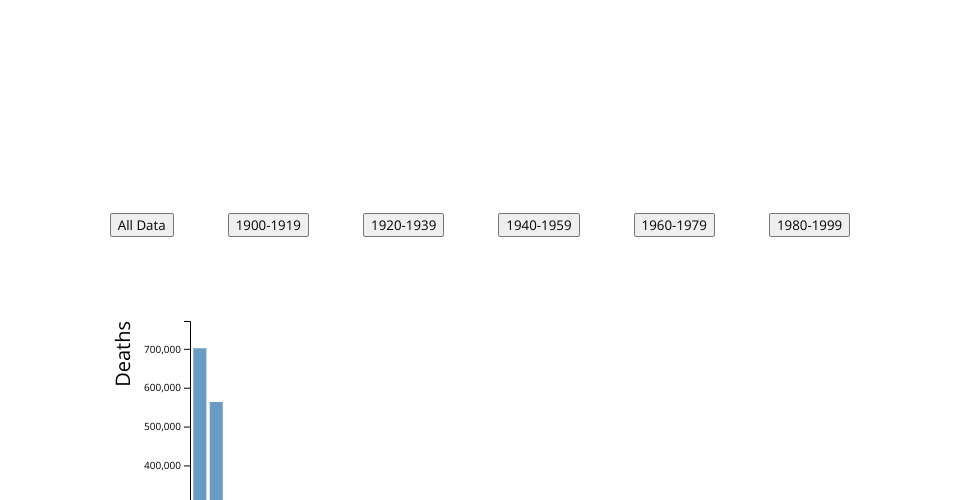
X-axis: region that earthquake occured.
Y-axis: Deaths in earthquake.
This bar plot shows the deaths caused by earchquakes in mutiple regions in different period of 19 century.
MIT Licensed