Data: https://gist.github.com/Junying-Li/72ef4641efd6b4abf371f5d9f4267a56
Iterated from last week's visualization.
What's new?
- Added latitude and longitude to data.
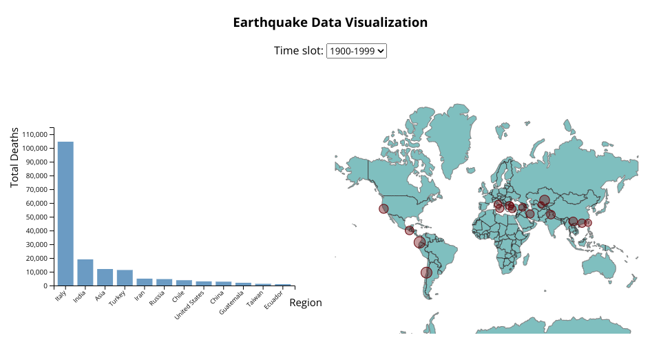
- Added interactive world map with circles showing where earthquakes occured, and the radius of circle shows richter of earthquake.
- Changed the layout. Now all visualizations are in the same page.
Todo:
- Add tooltips.
- Change buttons to menu.
Bar plot:
X-axis: region that earthquake occured.
Y-axis: Deaths in earthquake.
World map:
Circle: positions where earthquake occured.
Radius: richter of earthquake.
The bar plot shows the deaths caused by earchquakes in mutiple regions in different period of 19 century. The world map shows the positions where earthquakes occured and how strong they were (richter scale).
MIT Licensed