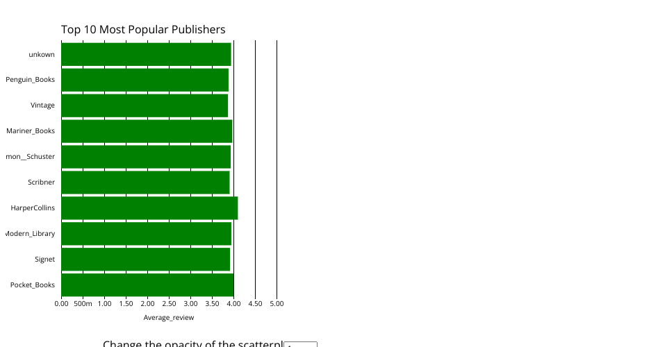
Welcome to my project current draft. Ths is made up of 2 graphs, the left graph which shows the relationship between number of pages and average review for that book, with each data point representing that book. Bottom acis is num pages, left axis is avg review. The right graph is made up of the top 10 most popular publishers (decided by how many books were publsihed with that author) with the bottom axis being the average rating acorss all books published underneath that publisher and the left axis being that publisher. They are sorted top to bottom by number of books published.
The main interaction between the 2 graphs is the highlight feature. If you hover over a datapoint or a bar it will highlight all books with the same publisher. The bottom right of the chart also a opacity drop down button that will make ot easier to see all the datapoints.
Things to do:
Fix the bars since they are not lined up correclty with the bottom axis
A bare minimum HTML page demonstrating use of CSS and JavaScript.
See also React Starter.