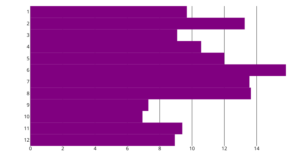
A Bar chart for USA Flights on-time Performance Analysis using the React & D3.
This visualization is an analysis about USA flights on-time performance. Each bar represents one month.
Experience :
1> While making this visualization, data pre-processing took me 2 days to get the final result, which is the USA flights delay condition by month. I also got the result by date/day/week and will play it around later.
2> Drawing this bar chart using React & D3 was much more difficult than using vega-lite-api, but it was also more interesting when I created all elements one by one by myself.
One idea I got from these two weeks' assignment was, when I want to realize a visualization in the future, I could use vega-lite-api first to try out all the ideas, and after choosing the best one I can use React & D3 to realize it. However I am not sure if my understand is right or not lol.