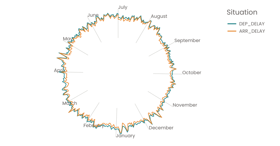
A radial chart of USA airlines on-time performance.
Things have done:
- Used a cleaner way to transform the chart to center
- Learned how to close the line: using d3.curveLinearClosed
- Used a cleaner way to choose the range for radiusScale: innerRadius, outerRadius, angleAxisOffset
- Added a colorLegend
Things doing:
- Adding axes (tick marks and labels) for angle: using pointRadial
- Making the colorLegend interactive
Things to do:
- Adding axes (tick marks and labels) for radius
- Choosing a range for the angle scale that represents some periodic amount of time, like years, months, or weeks.
MIT Licensed