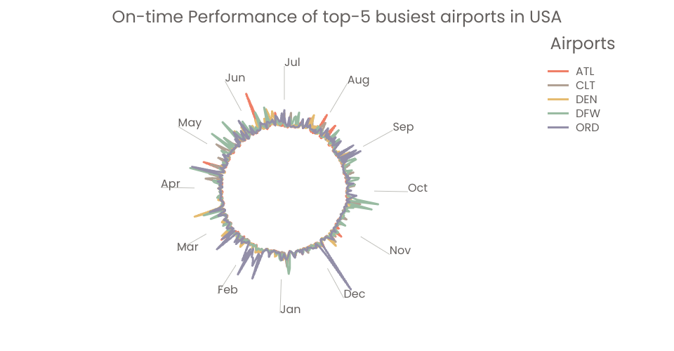
A radial chart of USA airlines on-time performance.
Things have done:
- Used a cleaner way to transform the chart to center
- Learned how to close the line: using d3.curveLinearClosed
- Used a cleaner way to choose the range for radiusScale: innerRadius, outerRadius, angleAxisOffset
- Added a colorLegend
- Made the colorLegend interactive
Things doing:
- Adding axes (tick marks and labels) for angle: using pointRadial
Things to do:
- Adding axes (tick marks and labels) for radius
- Choosing a range for the angle scale that represents some periodic amount of time, like years, months, or weeks.
00:44 - Part1: Interesting Works Done 04:22 - Part2: Final Project - USA Airports On-time Performance 08:49 - Part3: Future Works
Github: https://github.com/Echo226/dataviz-usa-flights-performance Vizhub: https://beta.vizhub.com/Echo226/40f6502388de4c4d8e985fffbff1d23e
MIT Licensed